June 2014
Publish in Marquetarian and American Marquetry Journals
I was recently thinking about the drawing elements of line, tone and texture in relationship to marquetry. We do not (often) see a marquetry picture comprised of lines as we would in a line drawing with pencil on paper. I came across a book on technical drawing of buildings (Drawing Techniques for Designers by William Lockard). In the book there was a picture that I experimented with in marquetry to demonstrate tone and texture. The drawing was the inside of a building with light coming through the open roof on the left side.
My version of the pencil drawing is shown below. I used an H2 for the line drawing and then B1, B2, and B4 for the shading.
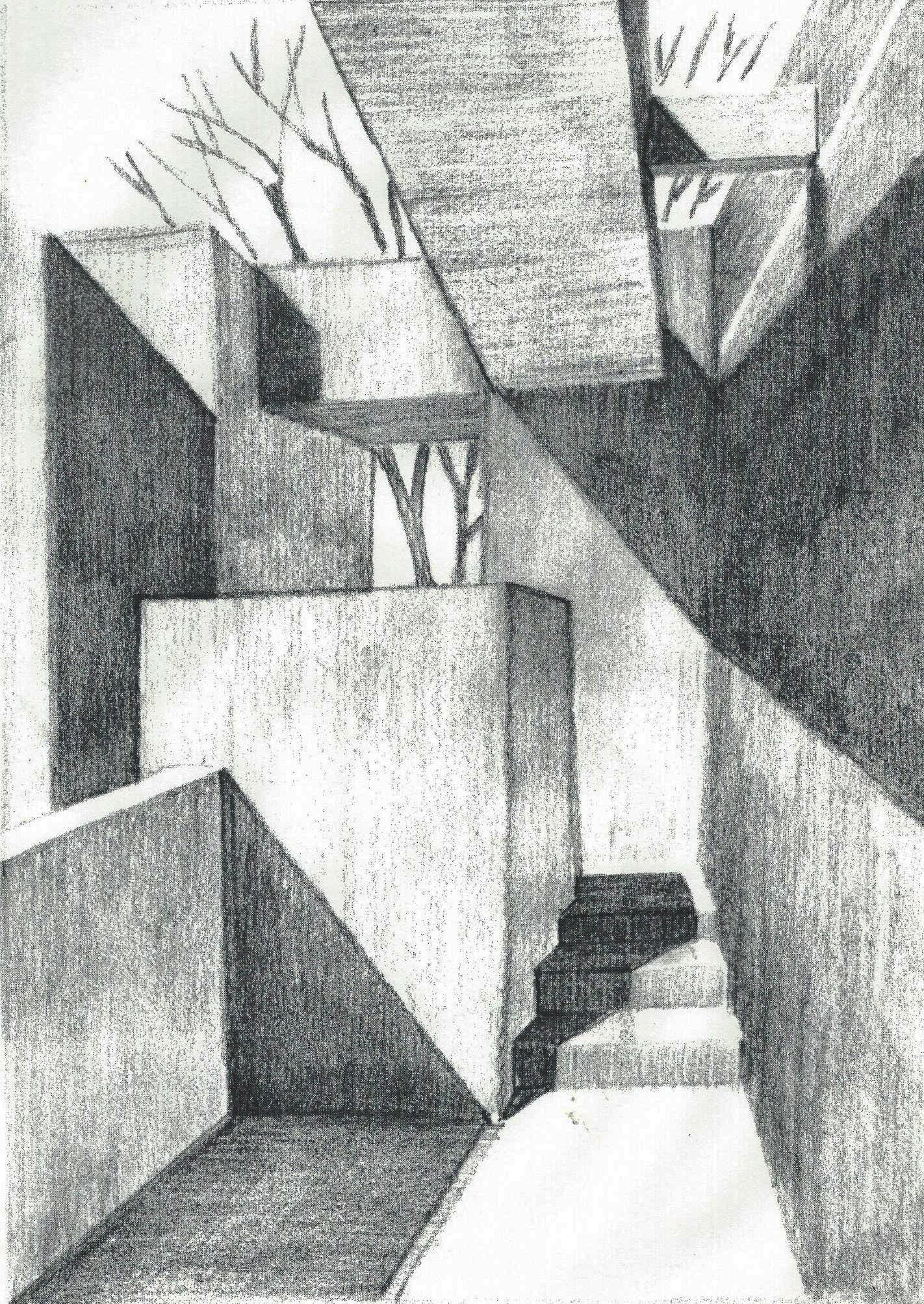
Tone is defined as the degree of lightness or darkness of an area. Tone varies from the bright white of a light source through shades of gray to the deepest black shadows.
Tone of an object depends on its actual surface lightness or darkness, color and texture, the background and lighting.
Analysing the drawing, the light source comes from the top left side – daylight, possibly the sun. This light casts dark shades (B4 pencil) on the parts of walls that are hidden or behind another wall or structure.
We also see some lighter shadows (B2 pencil) on sections of walls that will have some reflected light and so the shadow is not as dark.
For the walls where the light falls I used a B1 pencil to distinguish from the sky and white floor to avoid having lines in the drawing.
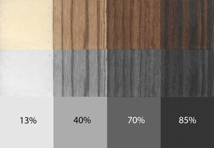
The value of tone in the gray scale can be measured as a percentage of black. The tones used in this picture can vary depending which pencil is used and how much pressure is applied. The main objective is to create enough contrast so that the end result represents how we see the shadows.
I scanned the picture I drew into Photoshop and created a grayscale palette of the drawing.

I then tried to select veneers that would create a similar gray scale palette. There is very little texture in this drawing so I started first with a selection of four veneers that had very little visible grain of texture.
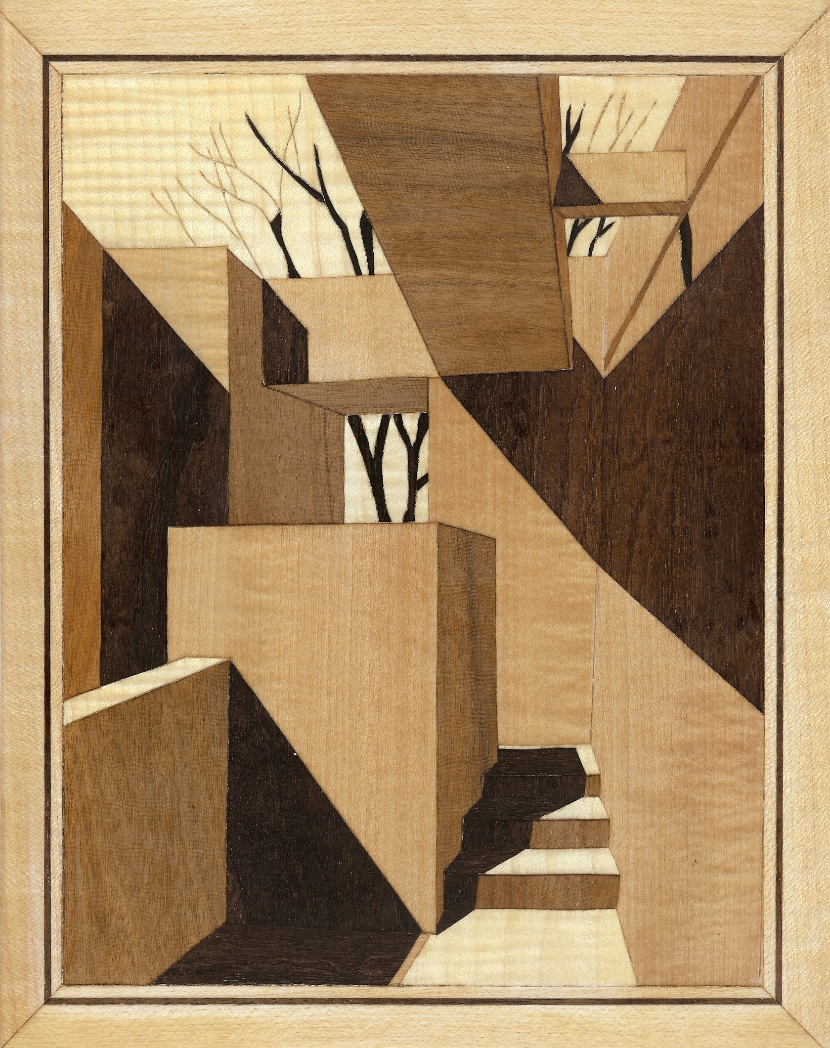
- Horse chestnut – the white sky, floor and top of wall
- Sycamore – walls in the light (B1 pencil)
- Australian Walnut – walls with lighter shadows (B2 pencil)
- African Walnut – walls with darkest shadows (B4 pencil) – and the tree.
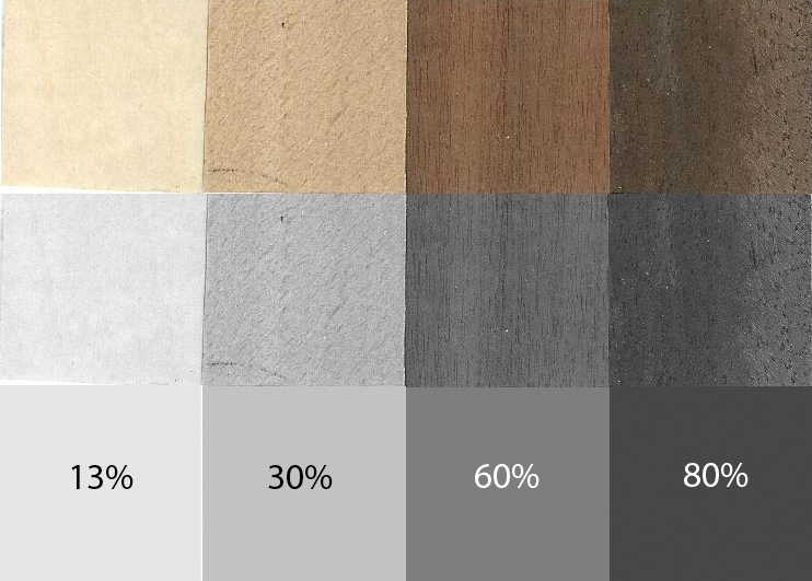
I cut some samples of the veneers to make a palette which I scanned into Photoshop. I then converted the scanned image into gray scale from which I tried to identify the gray scale values of the four veneer squares.
I’m not suggesting that one needs Photoshop to create a palette of veneers before making a picture. This is usually done based on sight and experience.
I only use Photoshop here to identify the gray scale values of what I am demonstrating.
The completed marquetry picture is shown below. The light source comes from the left top and appears to be daylight or rays of sun light. The picture exhibits little or no texture, but is still representative of the original drawing. The selected veneers show the required contrast between various shadows.
I then decided to redo the marquetry picture but this time using the same veneers for the building but using African Walnut for the sky and Australian Walnut for the tree.
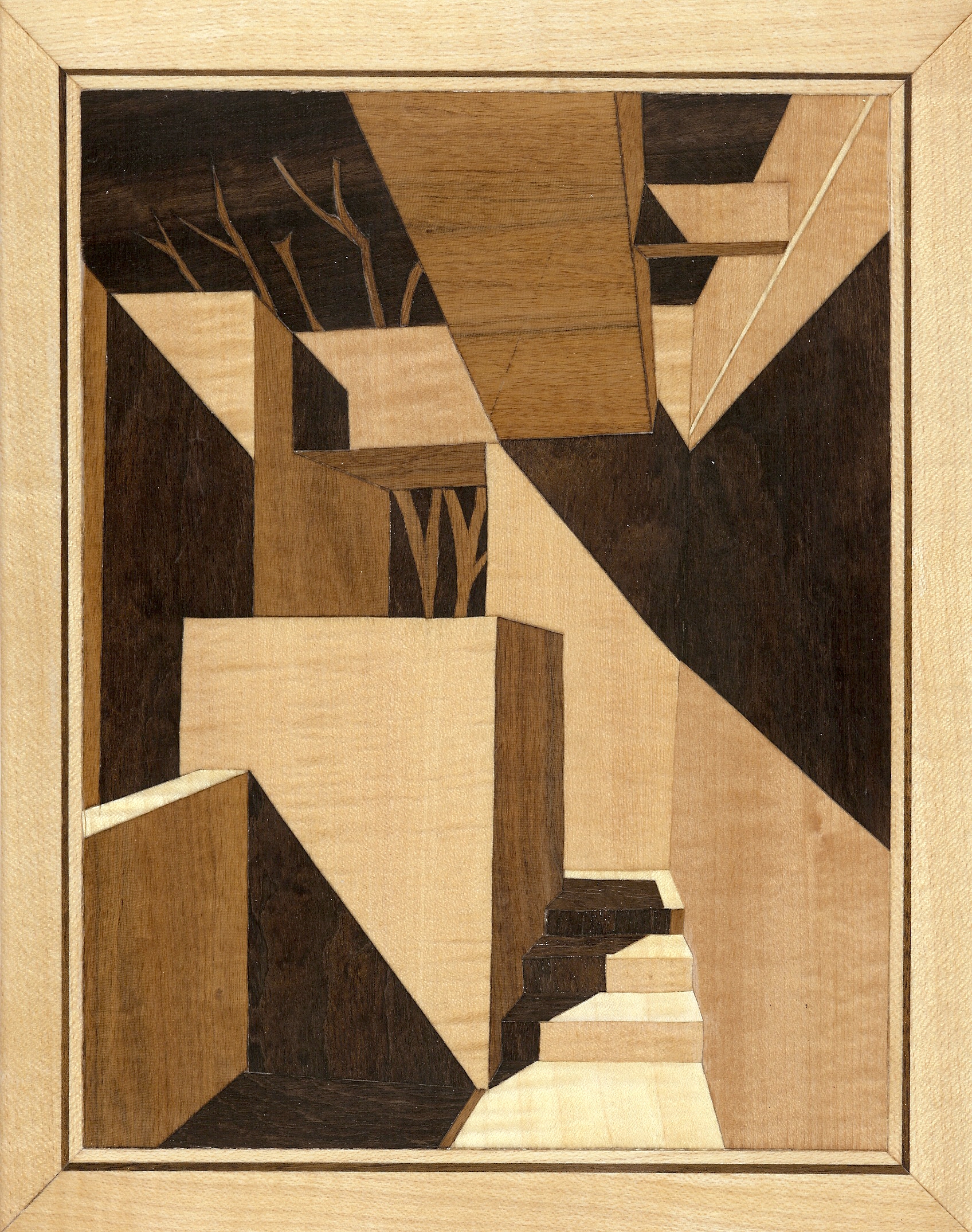
I thought the result made an interesting comparison. The light source in the night picture immediately makes me think that it is from moon-light. The only difference between the two pictures is the background, and demonstrates how our perception of light and dark changes.
The other aspect of our perception that I wanted to demonstrate was texture. For this I chose a different set of veneers.
- Horse chestnut – the white sky, floor and top of wall
- Zebrano – walls in the light (B1 pencil)
- Red Oak – walls with lighter shadows (B2 pencil)
- Ebony Macassar – walls with darkest shadows (B4 pencil) – and the tree.
Using some sample pieces I created a second palette of veneers and scanned it into PhotoShop to identify the gray scale values.
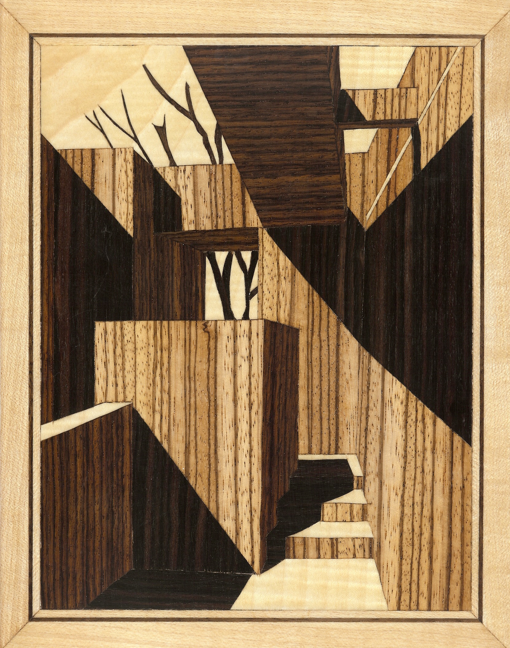
I did not re-draw the original pencil drawing with line texture, which I could have done. I chose just to redo the marquetry picture with this selection of veneers. Adding texture in this way certainly makes a significant different to the picture when compared to the first marquetry version.
For the fourth and final version of the picture I introduced the use of sand shading where appropriate. This can be a useful technique to add more texture and an element of 3-dimentions.
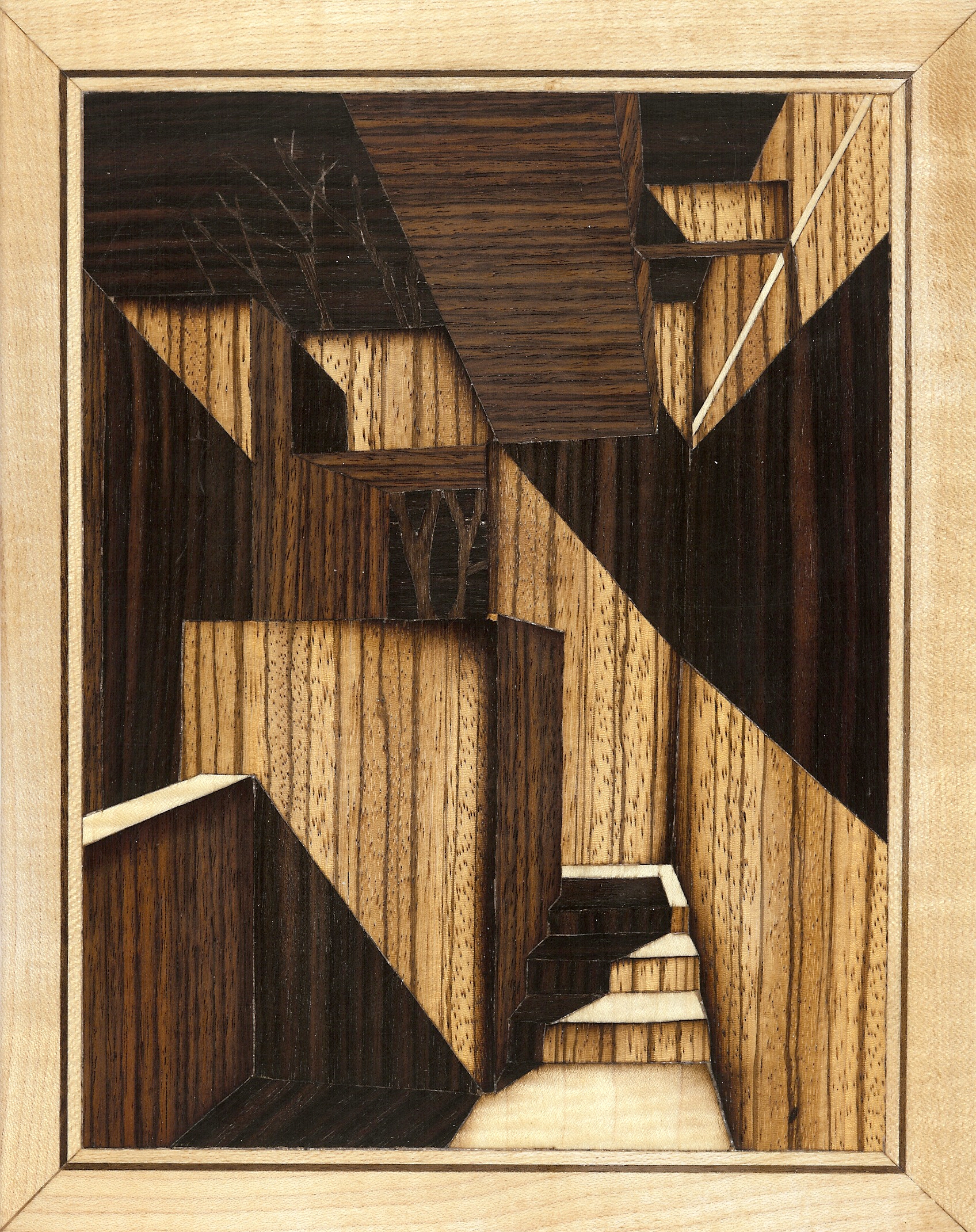
In this night version the picture seems to have more depth with a sense of 3 dimensions. The edges of the building are a lot softer, not as sharp, and perhaps more realistic.
These four pictures demonstrate the use of tonal values and textures in marquetry pictures using different veneers. The extent to which one uses these is always based on a personal preference.
In producing a marquetry picture it is always possible to use more tonal values than just 3 or 4 as was demonstrated in this article.